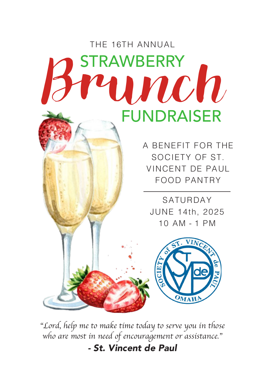
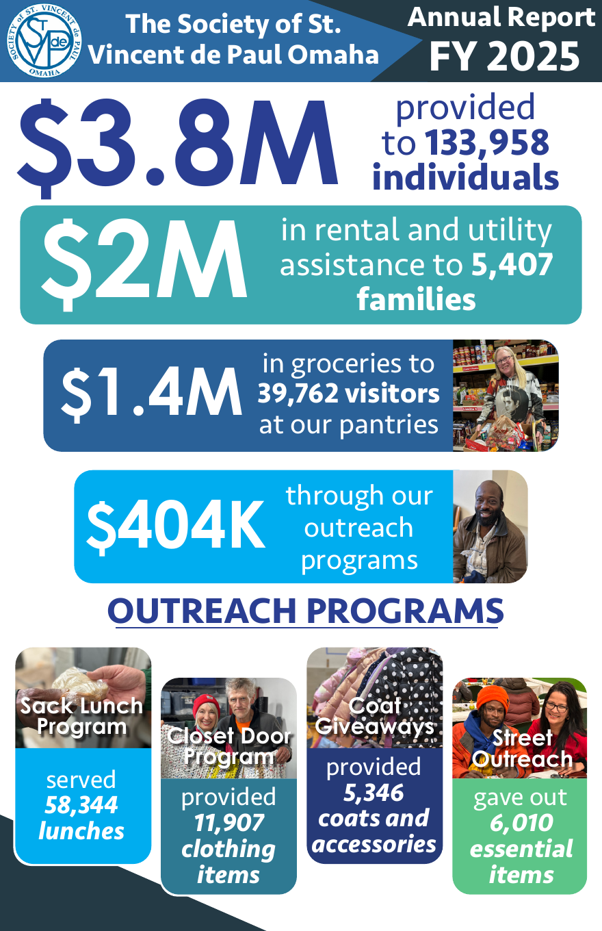
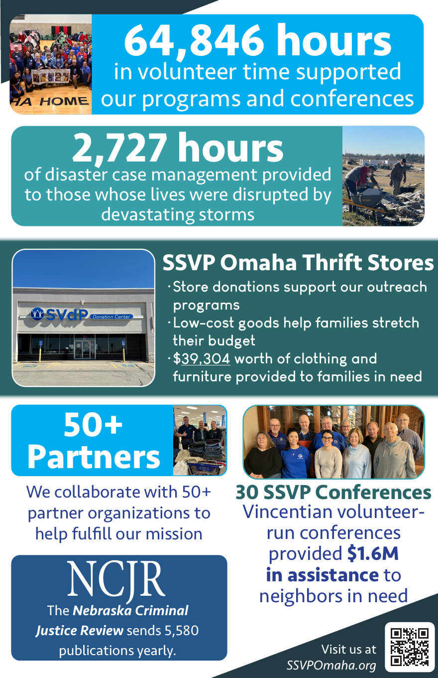
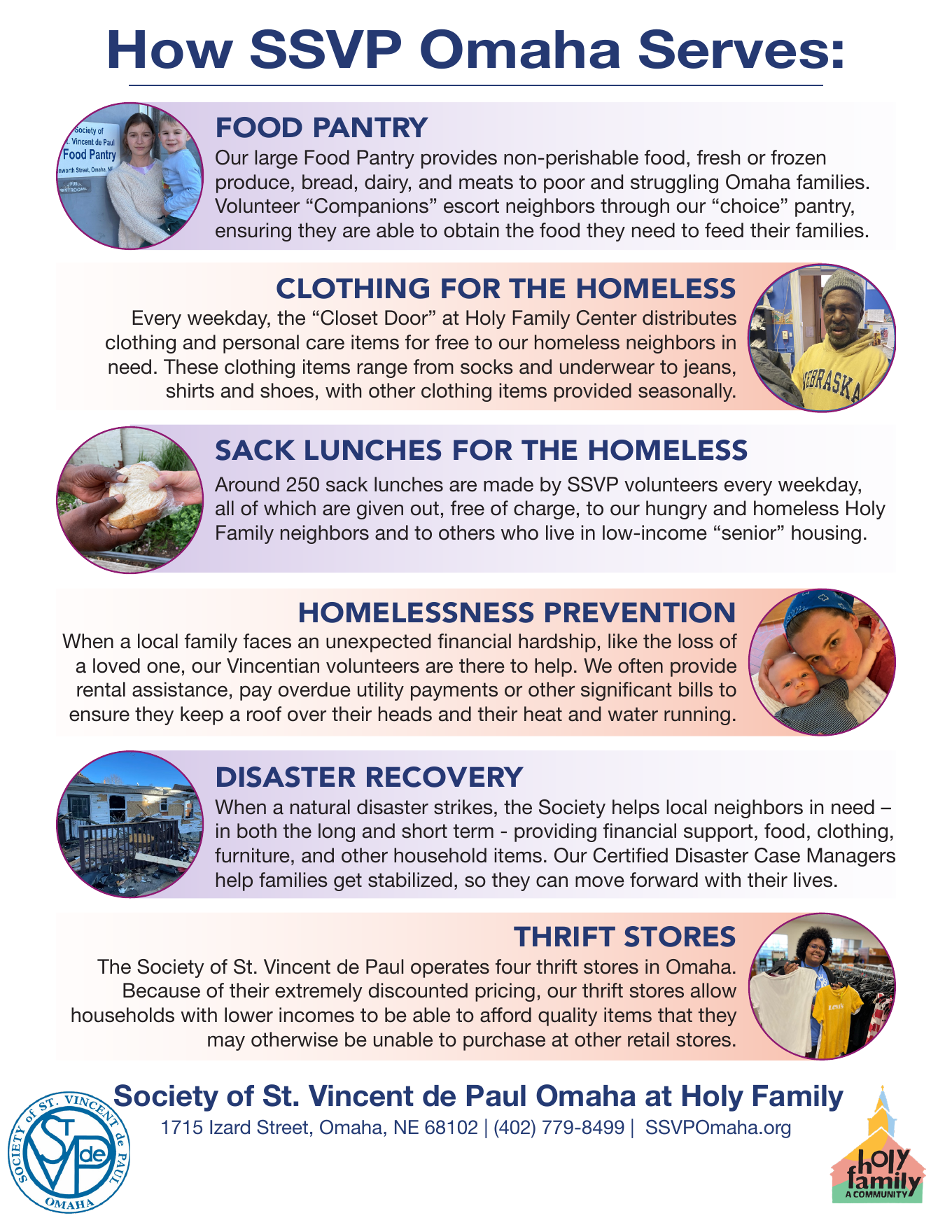
Designed an easily readable and data-driven report that anyone could pick up and understand the organization's mission and programs.
Visual hierarchy and color-coded sections were used to guide readers through each program and its impact on the community.
This program was designed to reflect the welcoming atmosphere and natural beauty of the Midwest for visiting members from across the region.
Careful spacing, hierarchy, and layout organization helped simplify a dense schedule while keeping important events easy to find.
The front page photo was taken at a local nature preserve to ensure an authentic Midwest feel.
This mailing was sent to previous donors of the organization to highlight the powerful impact the organization had on its clients, while also showing the many different programs the nonprofit offers.
Color-coding is used differentiate each program and highlight the client quote on the front page.
Designed to reflect the elevated status of the fundraising event, this pamphlet uses an illustrative and tactile approach to convey the information about the event to its guests.
Designed a clear, approachable poster for people in need to learn about upcoming coat giveaways.
The layout prioritizes practical information first: dates, times, locations, eligibility details, and a QR code for more information.
Bold typography, high-contrast color blocks, and event photography help make the event feel accessible and easy to understand at a glance.
Social Media | Social Impact Storytelling
These designs were made to create and adhere to a clear brand look and message, with transparent blue overlays to differentiate the brand from other local nonprofits.
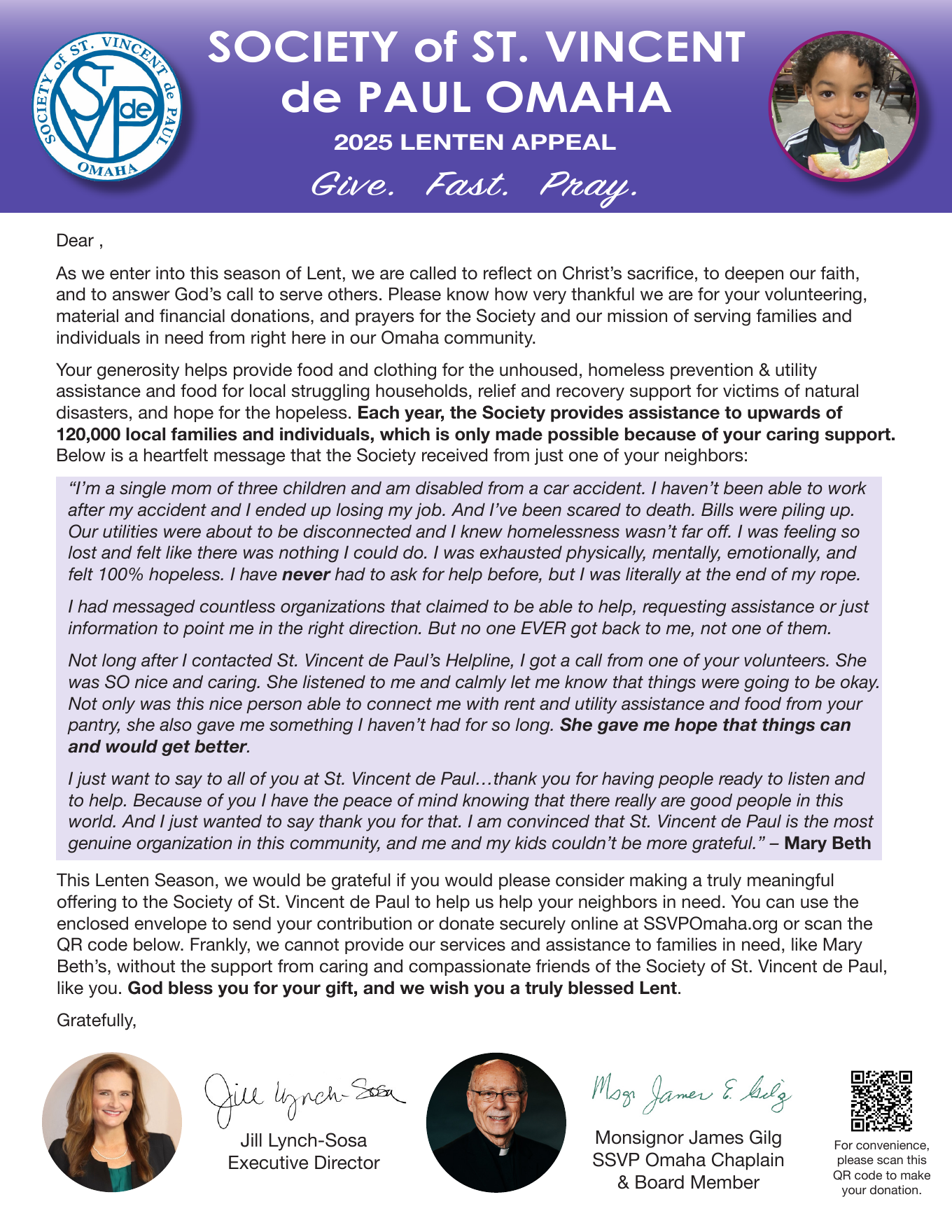
I spoke with clients and volunteers to learn their personal experience, gather pull quotes, and take their photos to highlight their story.